One ad can be the difference between Facebook being your number 1 acquisition channel or the channel that plummets you into debt.
A beauty & a beat at the same time!
So, how do you create winning ads and avoid wasting money on ads that do not work?
Take a look at the 10 Facebook ads below, we have torn them apart and pointed out what the company did right and what they did wrong!
Note that these posts were ads with “shop now” or “learn more” CTA’s but they get removed when viewing the post URL instead of in the feed as an ad.
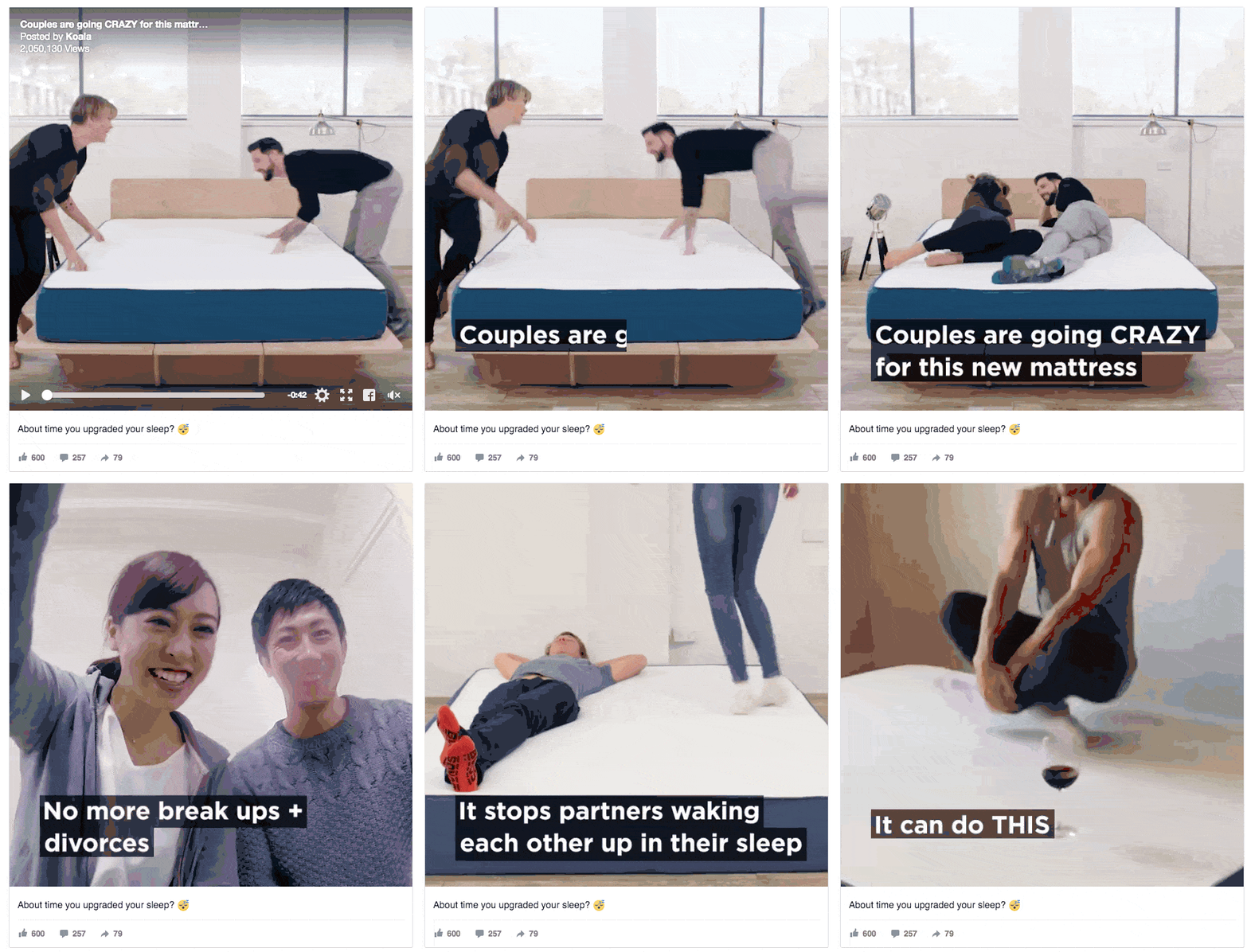
Facebook Ad 1 – Koala Mattress
Link – Live Post
What they did Right
- They made full use of video and added captions, 90% of people watch Facebook videos with sound off.
- They demonstrate something “amazing” about the product. Fist jumping on a mattress with a wine glass, second the option to adopt/support a Koala in need. This shows the quality of the product and also adds an emotional pull towards the band.
- They are calling out “couples” and probably targeting people in a relationship. Always try and align your targeting with your ad messaging (vice versa).
What they did wrong
- They could have added a lot more to the text area, no everyone wants to watch a video.
- They did not add a link in the text area, this is a lost CTA opportunity.
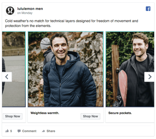
Facebook Ad 2 – Lululemon Men
Link – Live Post
What they did Right
- Great use of the carousel ad format showing the product in “product + lifestyle” shots.
- Did a good job at featuring the same model in multiple locations using the jacket for multiple use case scenarios.
- They mentioned features on each slide, which makes users want to scroll through.
What they did wrong
- Again the text areas were underutilized, add a link to the product, features about the product, pricing, sale opportunity, limited stock, the collection (e.g. winter).
- They should have made use of the carousel card description area. Even if it is just the price or the brand name, this is an easy way to include some extra information.
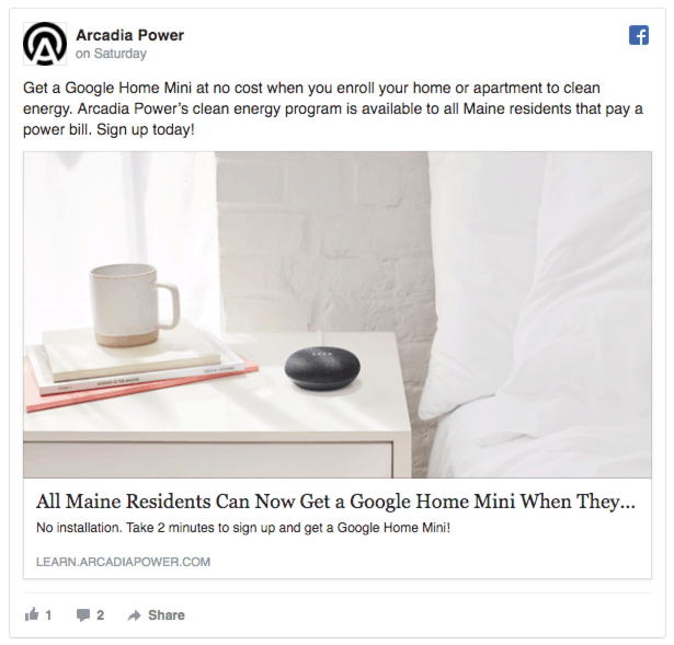
Facebook Ad 3 – Arcadia Power
Link – Live Post
What they did Right
- Great use of incentivization. Instead of getting into a pricing war with competitors they are adding extra value. Since this was a new product at the time and trending this added a lot of perceived value.
- Explained how “easy” it was to get the Google Home Mini.
What they did wrong
- Not clear what the ad is about, the image could have been more focused on the core product as opposed as a lifestyle shot of the bonus product.
- The title is cut off, make sure you stay within these limits otherwise people can not get the full message.
- Needed to use paragraphs in the text area to split up the text a little more and make it more “readable”
- Should have included a CTA in the text either to a link or click on the CTA button of the ad.
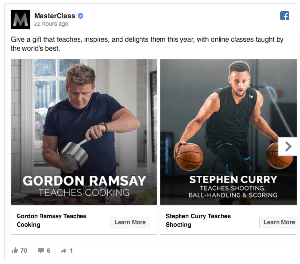
Facebook Ad 4 – MasterClass
Link – Live Post
What they did Right
- Awesome use of celebrity endorsement, this is extremely powerful when socially validating the quality of a product. Who doesn’t want to be taught how to cook like Gordon or play basketball like Curry.
- This is a gifting ad but could quite easily be a prospecting ad as well. The benefit of the gifting ad is that you have multiple friends that come to mind with each “skill” being taught. Much better than using a single image ad.
What they did wrong
- Could have split the text into 2 sentences. First explaining why this is a good gift idea. Then secondly explaining the quality of the gift.
- Could have added special pricing for a gift subscription and made it a limited offer.
- Could have turned this into a BOGO. Buy a subscription for a friend and get 6 months free for yourself.
FREE Guide: What we learned from spending $100 million on Facebook ads! [Download Here]
Facebook Ad 5 – Jumpcut

Link – Live Post
What they did Right
- This is a personal ad that looks very organic. This would be fantastic for remarketing if they were already familiar with who this is.
- Great use of the creative size. This ad is using a very tall ratio which will take up the whole screen.
- They have added captions to help people who do not have sound enabled.
- Have created scarcity around the closing time for the sale.
- Cleverly they are only giving away 12 months instead of a lifetime account.
What they did wrong
- Did not include the value of the course while it was not on sale. E.g. “this course usually costs over $699 a year but if you enroll before 11:59 pm PST you can get it for only %97 (that’s 96% OFF the regular price)”
- They should have tried to get the link above the “view more” cut off. This would have improved CPC and CTR.
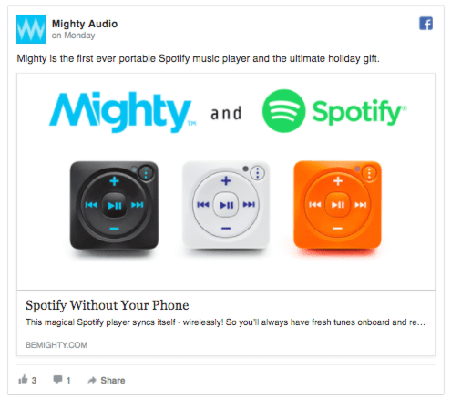
Facebook Ad 6 – Mighty Audio
Link – Live Post
What they did Right
- This is a great example of leveraging another brand to make your product more authoritative.
- Great use of a collaboration offer and using the brands’ logos in the image help demonstrate the partnership as well.
- If they were targeting people interest in Spotify they would have been able to get instant recognition and trust from that audience.
- Very clear function and value proposition.
What they did wrong
- Could have added a list of all the times you would want to use Spotify without a phone. This would have helped people connect with the ad. You want to generate that “yeah.. me too” feeling.
- This ad would not have looked very organic in the Facebook newsfeed. Using a lifestyle shot with a smaller logo and product feature might have made this a little less “ad” looking.
Facebook Ad 7 – Mama Home

Link – Live Post
What they did Right
- This ad is a fantastic demonstration of what the product does. It gives a lot of examples, clear explanation of how it works and what it does. Even better they do this quickly.
- the copy is using emojis to break it up.
- They are using arrows to the CTA as well as telling people where to click.
- Calling out free shipping as another advantage.
What they did wrong
- The first frame shouldn’t have been a pregnant lady, it should have been an example of their most popular demo or use. E.g. leg waxing or a nose pore cleaning.
- They might have been able to use a shorter link, this would have taken up less space on mobile ads.
- They did not mention the price. This would have been a good split test but using the price in the ad can prep visitors to buy.
Facebook Ad 8 – Patagonia
Link – Live Post
What they did Right
- Fantastic image creative, showing items that all make up an outfit.
- They are appealing to people who value social/corporate responsibility. This probably aligns with their target market/ideal persona. They could also target interest groups that include charities, sustainability, etc.
- A great explainer of the process they use to make their product, this also increases the perceived value of this product.
What they did wrong
- The text needs to be formatted so that it is easier to read. The use of emojis, symbols or paragraphs would have helped get the point across easier.
- They could have also included a link in the text.
- If they had a short video on the process this would have done better in terms of capturing people’s attention, then tagging products in on video or even remarketing people who watch over 50% of the video.
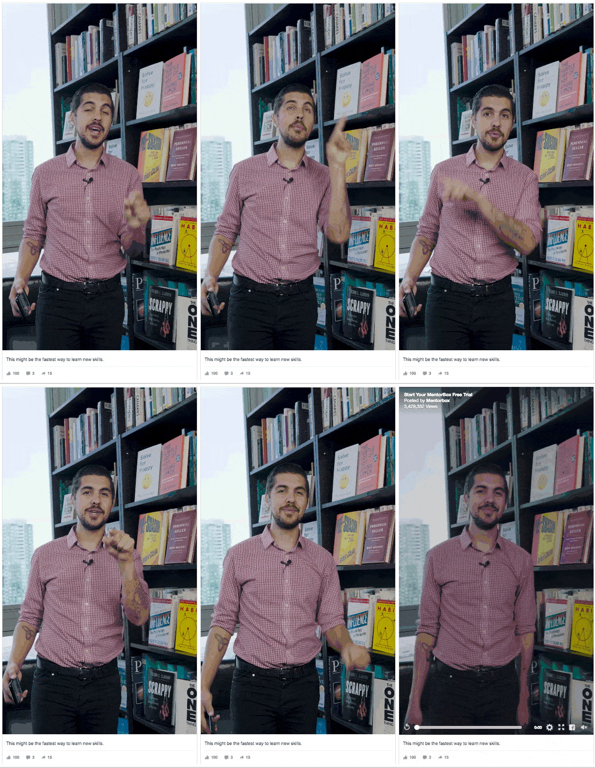
Facebook Ad 9 – Mentorbox
Link – Live Post
What they did Right
- Again, great use of the tall video takes up the whole screen on mobile. On a desktop, you get the blurred buffer on each side but it is a small price to pay to take up so much real estate in the feed.
- Got to 3 million views, this must-have cost a LOT of money considering their engagement is so low.
- Organic looking post.
What they did wrong
- No captions on this is a huge conversion killer. Especially because the video size is optimized for video as well. Facebook has auto-translate as well as .srt file uploads.
- Very little information and no link in the text area.
- The backdrop should have been all books so the video creative was balanced and people would focus on the speaker instead of the cars on the highway in the bottom left. Make sure you set up 1 focal point in your videos.
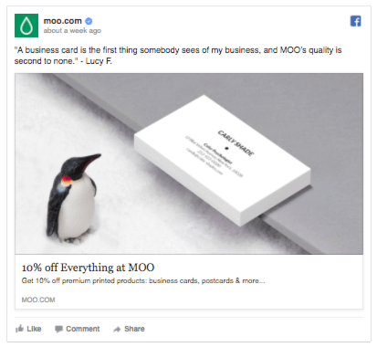
Facebook Ad 10 – Moo
Link – Live Post
What they did Right
- Using Press or Customer quotes is a great way to build trust and social validation.
- Using a “unique” image + product placement.
- Out of most people’s control but having a verified page helps, ask your Facebook rep if you are eligible!!!!
- Offering a discount, if this was a remarketing campaign to push me over the edge to complete my purchase.
What they did wrong
- They could have made the image more engaging. E.g. used an impressive design on the business cards, use a unique shape or fabric to show off the customizability of the service.
- Included more benefits of the product under the quote in the text area. It was great adding the quote but then what….. why is the product such high quality? how do they create a good first impression?
As you can see there are many aspects that go into making a successful ad. The key takeaways are.
- Make your ads stand out by being unique.
- Use a creative image or video sizes (square or 4:5 ratio)
- A lot can be done in the text area, use emojis, links, paragraphs, CAPS, lines, arrows. Whatever you can to make the text easy to read, entertaining and educational.
- Make sure your ad engages, teaches or entertains. You need to give someone a reason to stop scrolling!!!!
FREE Guide: What we learned from spending $100 million on Facebook ads! [Download Here]
If you have any questions about Facebook ads, make sure that you ask them in the comments below or in the Facebook group!
Jack Paxton is the co-founder of VYPER, a marketing tool that helps brands build email lists, social followings, and revenue using viral giveaways, referral, and reward programs. After millions of dollars spent testing different marketing strategies at his marketing agency. He then also co-founded Hyax a fast, conversion & design-focused course and funnel builder for creators.


Trackbacks/Pingbacks