Designing a killer giveaway landing page can make or break your campaign. A good giveaway can boost website traffic, grow your socials, and double your email list.
Using a giveaway page certainly beats having to host your giveaway on social media manually. A giveaway landing page is much more professional and ideal for hosting complex campaigns like partner giveaways.
While it may seem like a tedious task to create a landing page for your giveaway from scratch, we’re here to assure you that the process is not that hard.
This guide is here to provide you with a checklist of crucial components that you should include in your giveaway landing page, along with a few case studies.
Our goal is to help you to build stunning giveaway landing pages that convert quickly.
Let’s get started.
FREE DOWNLOAD: Get all Our Contest & Giveaway Marketing Guides, Checklists, and tutorials that have helped 100’s of brands collect 15k+ emails in under 21 days!
What Every Giveaway Landing Page Needs
To create a landing page that can efficiently manage your giveaway, you will need to include crucial components that will help convince your visitors to enter.
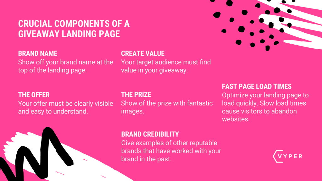
These components include:
- Your Brand Name
- The Giveaway Offer
- The Value Being Provided
- Excellent Page Load Times
- Brand Credibility
We analyze each component in detail below to provide you with a better understanding of why you need them on your giveaway landing page.
Your Brand Name
Branding is essential to any marketing campaign. When a person visits a giveaway landing page with your brand name on there, they will immediately know that you are hosting this giveaway.
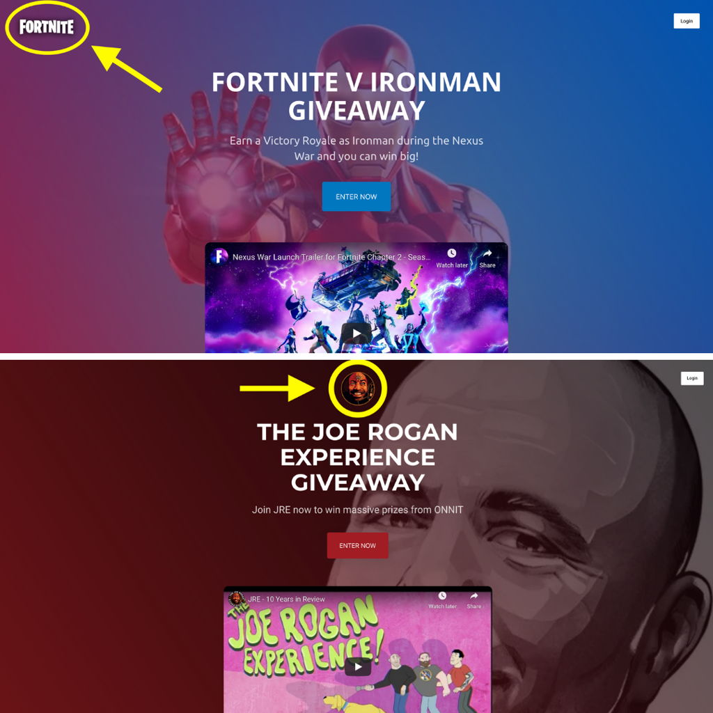
It’s always advisable to place your brand name (or logo) at the top of the page. This is the area that people will see first after the page has loaded.
Your visitors must notice your brand instantly, so they know what to expect from this giveaway.
Building Trust Faster
Sure, you can choose to omit all branding from your giveaway landing page. However, this can jeopardize the legitimacy of your giveaway.
In general, People are reluctant to pass on their personal information online. You have to gain a person’s trust before they are willing to submit their email address to enter the giveaway.
People are more likely to enter a giveaway that is hosted by a reliable brand. Your brand name can instantly persuade a user to take action. Mostly if they have interacted with your brand before.
Great Publicity
Giveaways and contests can easily go viral and gain tons of publicity. If done correctly, your giveaway landing page will receive high volumes of traffic.
There will be plenty of people who will discover your brand for the first time, making for an excellent brand building opportunity. This strategy is also ideal in creating brand awareness for those who have already dealt with your brand before.

The Giveaway Offer
When someone discovers your giveaway, the first thing they will want to know is:
What does this giveaway offer to me?
This makes your offer arguably the most crucial aspect of your giveaway landing page. It’s for this reason why you should place your offer at the top (alongside your brand logo).
In doing so, people who visit your giveaway landing page will instantly discover your offer and your brand logo. They will know right away who they are dealing with and what they can expect from the offer.
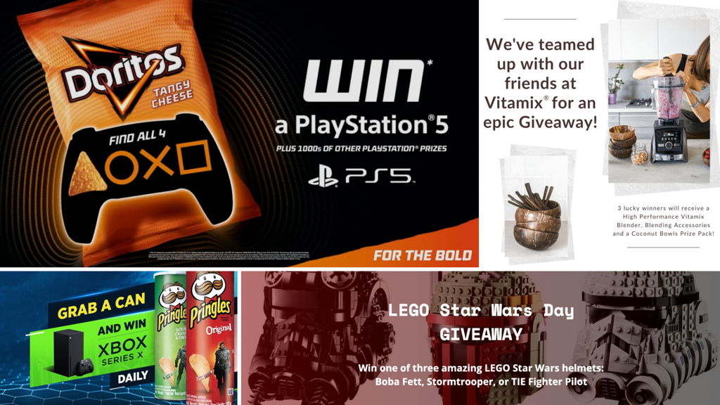
In the giveaways pictured above, all have clearly visible offers. The offers are further enforced by the addition of product and brand images. This allows the reader to visualize the prize and prepare themselves to enter.
Giveaway Offer Examples:
- Follow us on social media, and you can win a new iPhone
- We’re giving away a customized Nintendo Switch to 20 people that share our post
- Create and submit your LEGO build, and you could end up visiting the world-famous LEGO House in Denmark
- Take on the #7DayChallenge with Dove’s Beauty Bar, and you could win a free Spa day
- Sign in to the New Domino’s Pizza App and stand a chance to win Free Pizza for a Year!
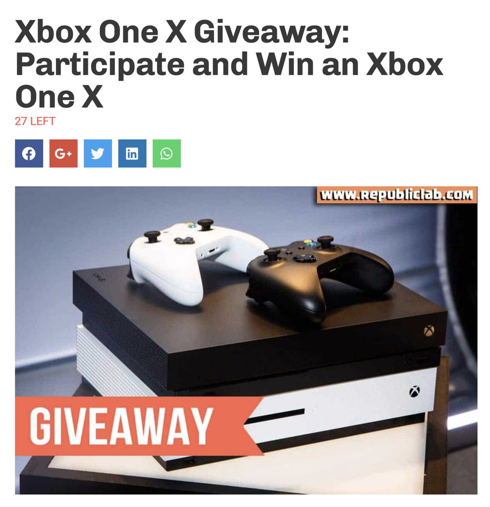
Republic Lab created a dedicated landing page (pictured above) on their website for their Xbox One X giveaway. They often host giveaways and tend to simply create “blog style” landing pages for each campaign.
This allows Republic Lab to insert their offer into the page title. The blog format is also ideal for displaying a large amount of information, which can be good for SEO.
Republic Lab includes the following in the above post:
- The giveaway offer
- Image and description of the prize
- How to enter
- Ts and Cs
The only issue with this landing page is that only part of the offer appears in the title.
Placing the Offer Lower Down
Let’s say that you want to use the space up top for a catchier title for your giveaway. You then move the offer lower down the page.
It might seem like you are “creating suspense” with the offer being placed lower down. However, it can be annoying and put off many potential visitors.
With the Republic Lab offer above, the offer isn’t clear enough as it says, “participate and win.”
There’s nothing wrong with this as you can explain to the reader how to participate in the first paragraph below the title or header.
However, Republic Lab only includes their explanation much further down the page.

The Giveaway Offer Done Right
Entering your giveaway should be quick and easy. A visitor should immediately get your offer and discover your brand name.
Your brand name will develop a visitor’s trust, and your offer will convince them to enter your giveaway.
If a visitor has to look for your offer, this will be unnecessary time-wasting, causing them to exit your campaign.
In the Demo Fortnite Giveaway campaign below, the full offer is placed at the top.
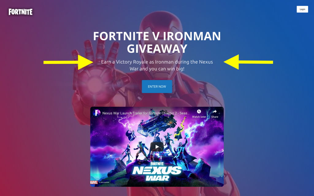
This campaign’s offer is a summary of what a user needs to do to enter the giveaway and win.
At this very point, the person reading the offer can immediately choose to enter the giveaway or leave the page entirely. No time wasted in searching for more details on your giveaway.

Click here to view a live demo of the above giveaway.
Create Value
- Will your target audience find your campaign valuable?
- Does the prize have a high monetary or sentimental value?
- Is this a “once-off” campaign that’s never to be repeated, or is it a monthly giveaway?
These are some crucial questions that your giveaway landing page should answer.
Creating Value for Your Target Audience
Going back to the Fortnite Giveaway, the prizes for that giveaway include a new PS5 console and a limited edition custom Fortnite controller.
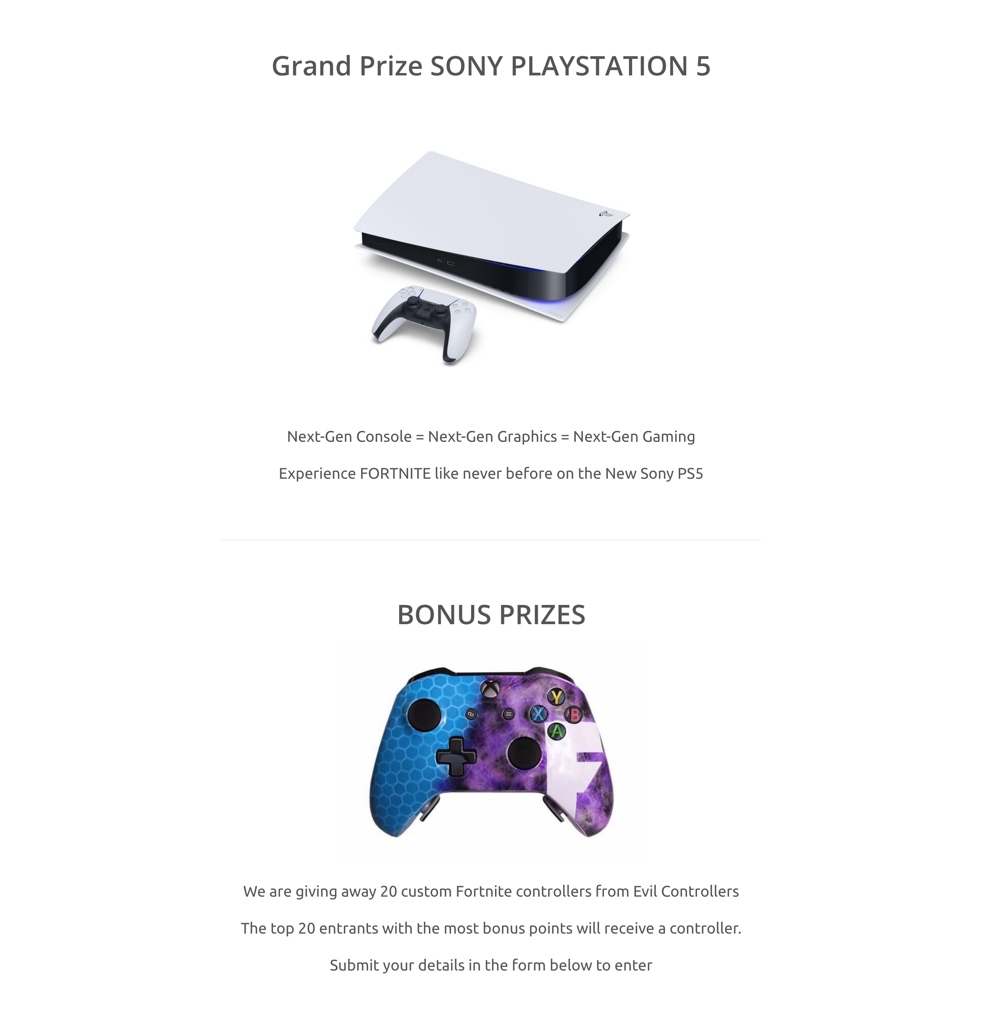
These prizes might not seem enticing to most people. However, gaming enthusiasts (especially Fortnite gamers) will consider these prizes as extremely valuable.
This increases the overall value of the giveaway as perceived by your target audience.
Monetary Over Sentimental
If the prizes for the Fortnite giveaway were a TV or a smartphone with a higher monetary value, the target audience of Fortnite players would not perceive those items as favorably as they would a PS5.
Sure, a TV and a smartphone are essential items. But for gamers, a PS5 will immediately stand out as it’s more important to them.
In the Weight Watchers giveaway below, the prizes include a Fitbit Smartwatch, cookbooks, and WW memberships. These prizes add up to a relatively low monetary value when compared to other giveaways.
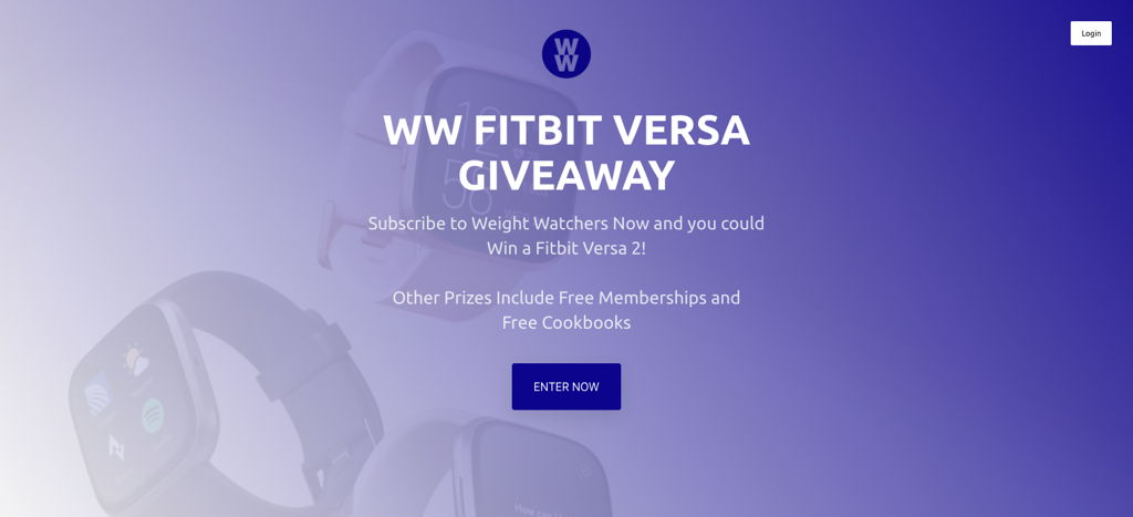
However, people into health and fitness will have a much higher perceived value for these prizes.
Monthly Giveaways
Hosting a monthly giveaway is beneficial for brands looking for a consistent lead generation strategy.
We call this strategy, “the evergreen contest funnel.” The goal is to set up a low-cost contest that will run continuously every month.
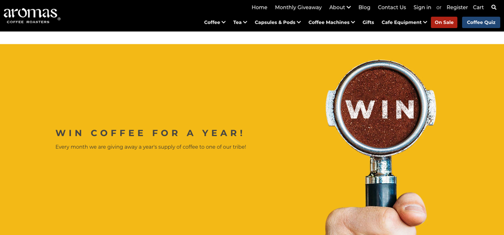
The downside to hosting a monthly giveaway is that users will find this kind of giveaway less valuable than a once-off giveaway. The reason being, it’s not a big deal if they don’t enter now. They can just try again next month.
The fear of missing out (FOMO) is reduced substantially with a monthly giveaway. Users will be more inclined to hurry up and enter a giveaway that will never run again.
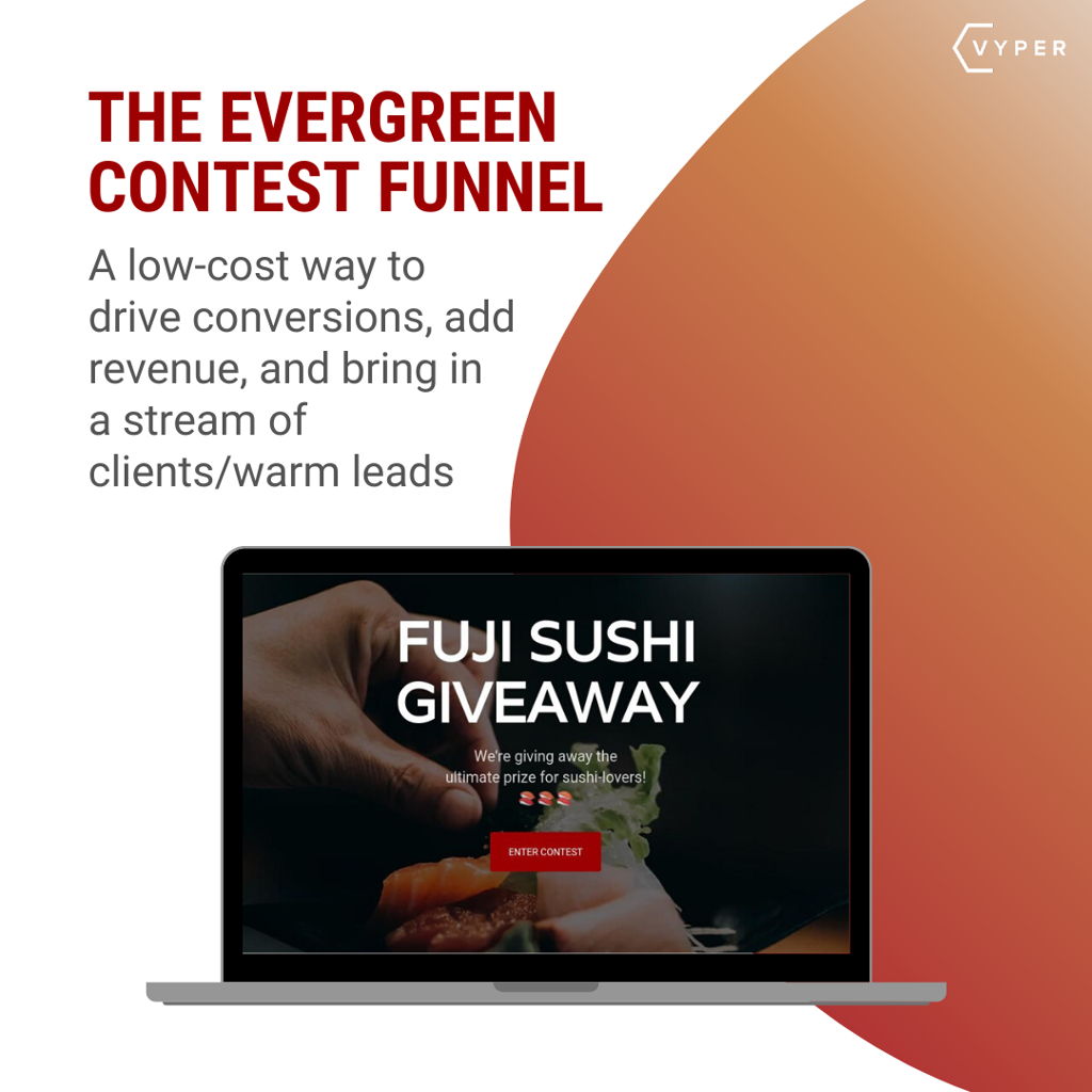
Hosting low-cost contests regularly will help you to consistently grow your business.
Want to learn more? Read the full post here.
Excellent Page Load Times
A crucial factor of any landing page is its page load speed. People expect website pages to load almost instantly.
If your landing page loads slowly (like its the year 2000), it will frustrate the user. That user will leave the page, no matter how good the offer is.

Slow page load speeds impact negatively on the overall experience of visiting your website. Even online shoppers abandon their carts because of pages that take too long to load.
Mach Metrics Speed Blog states that:
“1 out of 5 online shoppers will abandon their cart because the transaction process was too slow.”
To eliminate the frustration caused by slow page loads and create a seamless experience for your users, you will need to optimize your giveaway landing page.
An optimized giveaway landing page that loads quickly will allow giveaway entrants to submit their entries with no hassle at all promptly. A fast and easy entry method can lead to an increase in giveaway entries (leads).
Optimizing Your Giveaway Landing Page for Speed
You can use a free service like GTmetrix (pictured below) to analyze your landing page load speeds.
Services like GTmetrix will analyze your landing page and provide you with a full report that includes areas that need tweaking.
You can then edit those items, re-test, and repeat until you achieve desirable load speeds.
From our experience, we found three common landing page elements that interfere with page load speeds. Those elements being website widgets, Images, and videos.
You can resolve these issues by completing the following:
- Remove plugins and widgets
- Compress images
- Host video on external platforms
Remove Plugins and Widgets
Plugins and widgets can make your website look amazing and provide additional functionality to your landing pages. However, they can also add bulk to your pages, which can lead to low load speeds.
If you are designing a dedicated giveaway landing page on your website, you could select a simple template that does not include a widget sidebar.
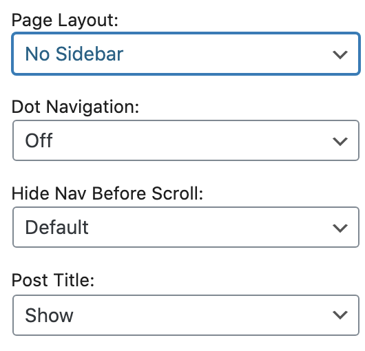
Instead, create a simple form that users can use to submit their entries. That can be good enough to generate leads from your campaign.
Compress Images
High-res images will increase the quality of your landing page. The page will look amazing when it eventually loads!
You can still have great looking images on your website that load faster because of its smaller size. To achieve this, you can simply resize your images.
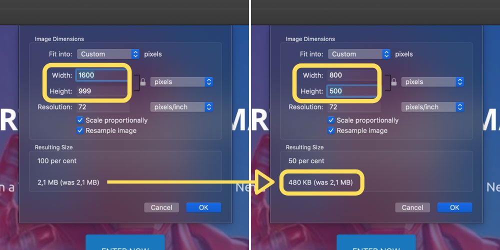
In the image above, we reduced the image’s resolution by half (from 1600 pixels to 800 pixels). This action drastically reduces the file size from 2.1MB to 480KB.
The image will now load faster because of its smaller size. It will also still look great at its lower resolution of 800×500 pixels. A resolution this size is sufficient enough to appear clear and crisp on most websites.
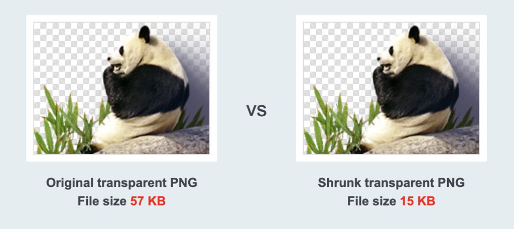
Alternatively, you can use a service like TinyPNG to shrink images with little to no loss in quality.
Host Video on External Platforms
Most websites do allow you to upload custom media like videos. However, large video files can slow the page speed or take a while to buffer.
Video-centric services like YouTube and Vimeo are optimized to load quicker and automatically play a video at reduced resolutions to accommodate slow internet speeds.
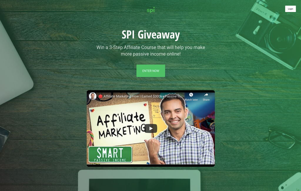
For the Smart Passive Income Giveaway, a YouTube video was embedded into the giveaway landing page.
If the video is about your giveaway, then it will also gain additional exposure on YouTube.

Click here to view a live demo of the Smart Passive Income Giveaway.
The Product / Giveaway Prize
It’s essential to include images of the products that make up the giveaway prize. Giveaway entrants that can visualize the prize will be more enticed to enter immediately.
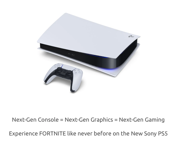
Adding a suitable description will make your product stand out more. For the image above, instead of only stating “Win a PS5!” we included additional text like “Next-Gen Console” and “Experience Fortnite like never before.”
The PS5 image and description above will get users to picture themselves playing Fortnite on a next-gen console. People will be excited to enter a giveaway, knowing that they will potentially end up playing on the latest PS5 console.
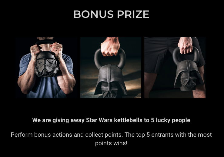
Product images are also essential to motivating users to perform better in online contests. Your contestants will have to spend their valuable time and resources to complete tasks to earn a top spot in the contest.
The contest prize must be totally worth all of that trouble and enticing enough for contestants to fight off each other for first place.
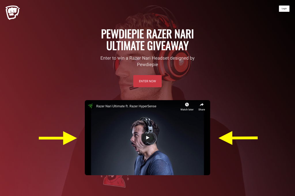
We recommend that brands place a product video on their giveaway landing page. You still need to add an appropriate description to product images. Video allows you to display a ton of information in a short space of time.

Brand Credibility
Your giveaway can potentially generate a massive amount of new leads. There’s a good chance that many of those leads will discover your brand for the first time.
Some people can be reluctant to submit their details to enter a contest hosted by an untrusted brand.
You can list your brand’s credibility on the giveaway landing page to earn your visitor’s trust quickly.
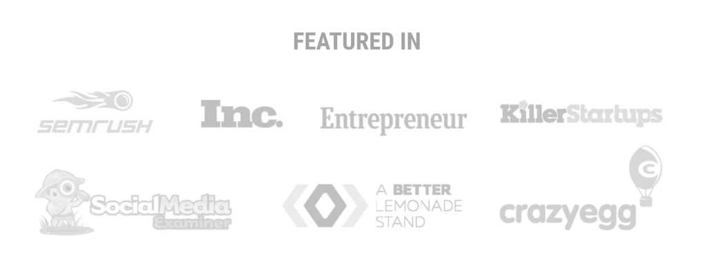
VYPER uses the brand names above on its homepage. Website visitors will immediately notice that our brand has previously been featured in top publications.
You can also include images of famous artists, musicians, or influencers using your product.

JOON does an incredible job of combining customer testimonials and brand names that have featured their products.
Giveaway Landing Page Examples
Complex LEGO x Adidas Giveaway
- Host: Complex / Overkill Shop / 43einhalb
- Entry method: Follow, comment, and share on social media
- Prize: High-end custom sneakers and replica Lego sneaker
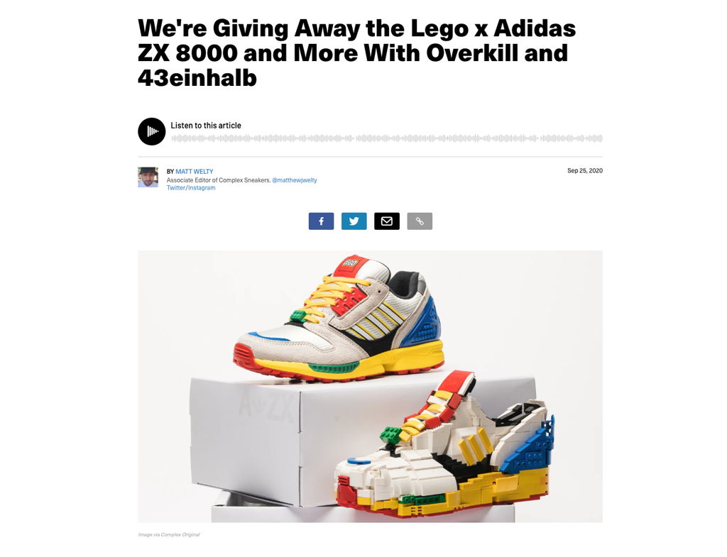
Popular lifestyle publication, Complex, teamed up with German brands Overkill and 43einhalb to host a sneaker giveaway. Users were required to interact with all three brands and the Instagram giveaway post to enter.
The landing page is in a blog format, which allows Complex to deliver as much information as they need to readers.
The Complex giveaway page includes the following:
- Brand name(s) and headline (giveaway offer)
- Multiple images of the prize
- Giveaway rules
- Details on how to enter
- Information on the prize (including monetary value)
- Information about selecting and announcing the winner
- Ts and Cs
Key Takeaways
- ✔️ The giveaway is hosted on the Complex blog. This means that the giveaway can directly generate traffic and revenue for Complex.
- ✔️ Acquiring social media followers and engagement is the focus of this giveaway, while boosting website traffic is a secondary goal.
- ✔️ This is a brand partner giveaway that can benefit multiple brands.
- ❌ There’s almost no information (brand credibility) for the partner brands
- ❌ Too much is going on with this page (ads, videos, posts, and more). There are also many distractions.
Doritos PS5 Giveaway
- Host: Doritos / PlayStation
- Entry method: Input a unique code from inside a Doritos bag into their website to win
- Prize: High-end custom sneakers and replica Lego sneaker
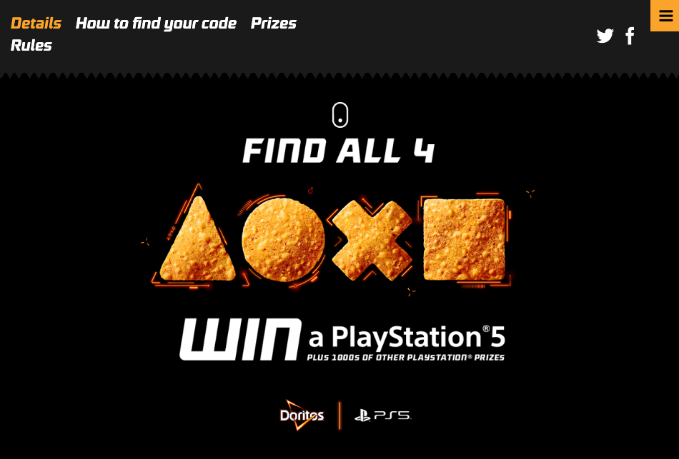
Doritos and Sony PlayStation teamed up for a mega PS5 giveaway that includes new PS5 consoles and 1000s of additional PlayStation and Dorito prizes. To enter, People must purchase a bag of Doritos and enter the unique code (found inside the bag) into the Doritos website.
The giveaway and entry method is located on the Doritos website, with additional instructions on the PlayStation Blog.

The Doritos giveaway page includes the following:
- Brand name(s) and giveaway offer
- Images of the prizes
- Giveaway rules
- Details on how to enter, including the actual entry method
- Information on the prize (included an approximate amount of prizes on offer)
- Information about selecting and announcing the winner
- Ts and Cs
Key Takeaways
- ✔️ The giveaway is hosted on the Doritos website. However, PlayStation also released a blog post on its website, complete with instructions on how to enter.
- ✔️ The focus of this giveaway is to promote the launch of a new product, the PS5.
- ✔️ This is a brand partner giveaway that can benefit multiple brands. Doritos can benefit from its products’ sales during the giveaway, and PlayStation can benefit from the promotion and exposure this contest will provide them.
- ❌ The giveaway landing page is a bit difficult to navigate. You have to click on additional tabs to view prizes and rules.
- ❌ It is also hard to figure out what the “1000s of other prizes” are. You will have to navigate to another page to find the actual prizes hidden away.
TL;DR
Giveaway landing pages are the way to go if you wish to achieve multiple goals from a single giveaway. You can host a giveaway on your website and still use that giveaway to increase social media engagement.
A well-designed giveaway landing page will efficiently convert visitors into leads, social media fans, and customers. Having a landing page means ultimate customization options, which is ideal when hosting partner giveaways, like the ones featured above.
Have you designed a giveaway landing page before? Let us know in the comments below.
Jack Paxton is the co-founder of VYPER, a marketing tool that helps brands build email lists, social followings, and revenue using viral giveaways, referral, and reward programs. After millions of dollars spent testing different marketing strategies at his marketing agency. He then also co-founded Hyax a fast, conversion & design-focused course and funnel builder for creators.

Trackbacks/Pingbacks